Nonprofit Branding: Why a New Logo Rarely Fixes It
connectNPO · Updated September 2026
Key takeaways
- Nonprofit branding is not the logo. Sector research defines a brand as the impression held in people’s minds, and names internal and external alignment as one of four principles for managing a brand.
- Independent Sector and Edelman found 56% of Americans report high trust in nonprofits in 2026, and 60% of people who engaged directly with one trusted nonprofits more afterward.
- The activities that raised trust most were advocacy, demonstrations and volunteering — things people did, not things they looked at.
- Most complaints filed under “branding” are really ownership, prioritization or publishing problems, and a new identity will not resolve them.
- There are real reasons to rebrand — a name that no longer fits, a merger, genuine confusion with another organization. Those are structural, not cosmetic.
The conversation usually starts the same way. Someone on the board mentions that the website looks dated. Someone else notes the logo has not changed since 2009. A staff member says the printed flyer, the Instagram account and the annual report look like they belong to three different organizations. And the meeting ends on a sentence that feels like a decision: we need to work on our branding.
It is a fair thing to say. It is also worth being honest about how most small organizations got here. Very few of them chose their brand. It accumulated. A volunteer made the logo. A former staff member wrote the tagline in an afternoon. The colors came from whichever template was open at the time. Nobody was careless. There was simply always something more urgent than typography, and there still is.
So the instinct to fix it is sound. What gets fixed is usually the wrong thing. Nonprofit branding is where organizations reach when something feels off, precisely because it is the part you can see. An organization spends a season and a meaningful share of its budget on a new identity, launches it, and eighteen months later feels more or less exactly as it did before. Not because the design was poor. Because the thing that was broken was never a design.
A brand is not something you commission. It is the residue of what an organization does over and over. Which means most nonprofit branding problems are operations problems — and a designer, however good, cannot fix an operations problem.
What “we need better branding” usually means
Here is a test that takes ten minutes and tends to end the debate. Ask five people connected to your organization — two staff, two board members, one long-standing volunteer — to describe what you do in one sentence, from memory, without opening anything. Then put the five sentences side by side.
If they do not match, you have your finding. The logo was never the reason those five people disagreed. When you ask what specifically feels wrong, the answers are rarely visual:
- Our materials do not look like they came from the same organization.
- We cannot explain what we do without using a paragraph.
- People confuse us with another group in town.
- Our website still describes a program we stopped running two years ago.
- Funders ask us questions we assumed the website already answered.
Only the first of those is even partly a design problem, which is the trouble with treating nonprofit branding as a design brief. The rest are about decisions nobody has made, or work nobody has published.
What the research says a brand actually is
The most useful sector work on this is still Nathalie Kylander and Christopher Stone’s study of brand in the nonprofit sector, published in the Stanford Social Innovation Review in 2012. It was built on eighteen months of structured interviews with 73 people across 41 organizations, run through Harvard’s Hauser Center with the Rockefeller Foundation.
Their starting point is blunt. “A brand is more than a visual identity,” they write — it is a construct held in the minds of everyone aware of the organization. You do not own it. You only influence it, through what people encounter.
The framework they built from that research, which they call the Nonprofit Brand IDEA, sets out four principles for managing a nonprofit brand. The first of them is brand integrity: the organization’s internal identity is aligned with its external image, and both are aligned with the mission. Integrity here is not the moral sense of the word. It is closer to how an engineer uses it — whether the structure holds together under load. Your brand is under load every time a donor emails and waits, or a volunteer shows up expecting the thing your homepage described.
The current trust data points the same direction. Independent Sector’s seventh annual study with Edelman Data and Intelligence, a nationally representative survey of 3,000 US adults published in July 2026, found 56% of Americans report high trust in nonprofits — stable against 2025, and higher than the military, the media, government institutions or large corporations.
The more useful number is underneath it. Sixty percent of respondents who had engaged directly with a nonprofit in the past year reported higher trust afterward, and the three activities that moved trust most were joint advocacy, attending a demonstration, and volunteering. Notice what those three have in common. Each is something a person did alongside an organization, not something they were shown.
Why a rebrand so often does not stick
Universities have a recurring argument with their lawns. An architect draws the walkways. Students then walk where they actually want to go, and by spring there is a worn dirt line across the grass that nobody designed. Groundskeepers re-seed it. It comes back. The path is not a landscaping decision; it is a record of where people actually walk.
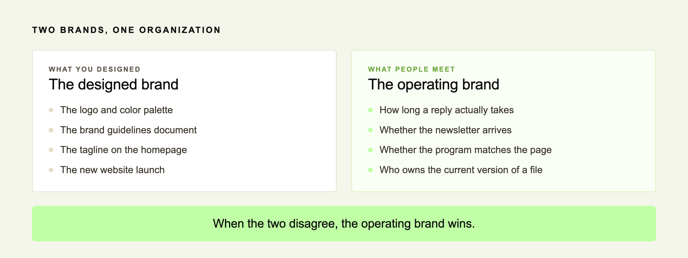
Brands behave the same way. You can publish the guidelines and update the letterhead. What people actually experience is the route your organization takes in practice: how long a reply takes, whether the newsletter arrives when it said it would, whether the program they turn up to matches the one described on the site. When the designed brand and the operating brand disagree, the operating brand wins. It is the one people are walking on.
It may help to think of a brand as closer to handwriting than to a logo. Your signature was never a design you selected. It is the accumulated residue of writing your name a few thousand times. You cannot redesign it in an afternoon. You can only change how you write, and wait.
The nonprofit branding problems that are not design problems
These are the five that come up most often, and what they usually turn out to be once someone looks underneath.
Every one of those has a fix. None of the fixes is a logo. And the fourth one is worth naming plainly, because it is the same failure we wrote about in donor retention — a relationship that consists of one annual request is not a brand problem, it is an absence of contact.
What to fix before you touch the logo
01
Write one sentence
What you do, for whom, without jargon. The test is whether a new volunteer can repeat it after hearing it once. Then use it everywhere, unchanged.
02
Give the files an owner
One person, one folder, one current version of the logo and the deck. Most inconsistency is not a taste problem. It is a permissions problem.
03
Make the work visible
People who have direct contact with the work report trusting nonprofits more. If people cannot see it, publish it — dated photographs, plain numbers you actually track, one short update a month. Being findable is part of it, which is where Google Ad Grants can help.
04
Fix two pages, then stop
The homepage, and whichever page people land on from search. Those carry most of the first impression. The rest of the site can wait a year.
Four items, none of which needs a design budget. If your organization is small or new, treat this as a starting shape rather than a standard — take the one that irritates your staff most, do that, and add the others as you grow. A short list you actually run beats a complete brand system you avoid.
When a rebrand is actually the right call
Sometimes the identity really is the problem, and it would be dishonest to pretend nonprofit branding is never the answer. These are the cases where design is the answer rather than the distraction:
- Your name describes a program you no longer run, or a service area you have outgrown.
- You are routinely mistaken for another organization, and it costs you gifts or referrals.
- The identity cannot function where you use it — unreadable at small sizes, no usable source file, breaks on a phone.
- You have merged, or split.
- The organization has genuinely changed what it does, and the current identity is now accurate about a former self.
Those are structural. If one is true, a proper design process is worth paying for — and it will go better once the four items above are settled, because a designer can only render a decision you have already made. On cost: there is no authoritative sector benchmark for what a nonprofit rebrand should cost. Any range you find quoted is a vendor’s pricing rather than research, and is worth reading as such.
Where this usually breaks
The identity is fine. The systems underneath it are not.
The organizations that read as strong are rarely the ones with the most refined identity. They are the ones where the thing you were promised and the thing you received turn out to be the same thing. That is an operating outcome before it is a design one. We are a nonprofit growth partner and this is the layer we work on. More about connectNPO, see how we work, or look at what support costs.
Frequently asked questions
What is nonprofit branding?
It is the impression of your organization held by the people aware of it, not the logo by itself. The 2012 Stanford Social Innovation Review study of brand in the nonprofit sector describes a brand as more than a visual identity, and sets out four principles for nonprofit brand management, beginning with the alignment of internal identity, external image and mission. Visual identity is one input into that impression, alongside every interaction someone has with you.
How much does nonprofit branding cost?
There is no authoritative sector benchmark, and any range you see published is a vendor’s pricing rather than research. A more useful question is what you would fix first if the budget were zero. The items that change how an organization is perceived most reliably, such as one agreed sentence and a single owner for shared files, cost nothing.
Do we need a rebrand or just a website refresh?
Most of the time it is a refresh. Rebrand when the issue is structural: the name no longer matches what you do, you have merged, or you are being confused with another organization in a way that costs you. If the complaint is that materials look inconsistent or the site feels dated, that is a refresh and an ownership decision, not a new identity.
How do we stay consistent with a small team?
Name one person who owns the current version of the logo, the deck and the boilerplate paragraph, and keep them in one folder everyone can reach. Agree one sentence describing what you do and do not reword it per audience. Consistency in small organizations is usually a permissions and access problem rather than a discipline problem.
Does branding actually affect fundraising?
Trust does, and the people reporting the most of it are the ones who have had direct contact. Independent Sector and Edelman Data and Intelligence found 56% of Americans reported high trust in nonprofits in 2026, and 60% of those who engaged directly with a nonprofit in the past year trusted nonprofits more afterward, with advocacy, demonstrations and volunteering moving trust most. That points at giving people something to take part in rather than at refining how you look.
Research cited is from the Stanford Social Innovation Review, Spring 2012, and Independent Sector and Edelman Data and Intelligence, July 2026, and was current when this article was published. connectNPO does not provide legal, tax, accounting, or Form 990 advice.