Nonprofit Video: Why One Minute Is the Cheapest Branding a Small Nonprofit Can Do
connectNPO · Updated September 2026
Key takeaways
- A small nonprofit does not have a branding budget. It has a first minute: the short window a stranger gives the website, the flyer or the email a friend forwarded. Branding is making that minute say the same true thing every time.
- A brand at this size is made of five things the organization already owns: one sentence, three numbers with how they were counted, the same photographs, one voice, and one website where all of it lives.
- Consistency is the part that fails. In our count of 150 small California nonprofit websites, 37 showed something plainly out of date, and on 21 of them it was an event, deadline or registration more than thirty days past, still advertised as upcoming.
- Tangible detail is what the research supports. In three experiments, concrete details about what a charity does significantly increased donations, working partly through the sense that a gift would have an effect.
- A one-minute video is the only version of the first minute an organization fully controls, and every website on the connectNPO plan comes with up to five a year, made only from the photos and clips the organization already has.
What does branding do for a small nonprofit?
It makes the first minute a stranger spends with you say the same true thing every time. That is the whole job. A funder opens the site the night before a board meeting. A parent reads a flyer on a community-center wall. A friend forwards an email with the line “this is the place we were telling you about.” Call it the first minute. It is not a measured figure; it is the small window a stranger gives you before moving on, and what they see in it is the whole of your brand: whether you look real, whether you look careful, and whether you are the organization they heard about or a different one with a similar name.
Organizations with marketing departments treat branding as a project with a budget and a launch. At a quarter of a million to a million dollars a year, that project is easy to postpone for years: the logo was made by a volunteer in 2014, the photographs are from a gala two directors ago, and the sentence that describes the work changes depending on who is asked.
The reframe this post argues for is small. A brand at this size is not the logo and not the colors. It is the first minute, and the first minute is made of things you already have. If you want the longer argument about why a new logo does not fix a branding problem on its own, we made it in an earlier post on nonprofit branding. This one is about what to do instead, and why a one-minute nonprofit video turns out to be the part of the first minute you can control completely.
Why branding matters more when the budget is small
A small organization is seen by fewer people, so each exposure carries more of the picture: the program officer, the reporter, the new board member, the family deciding whether to walk in. A disagreement between two of those exposures has nowhere to hide.
The disagreement is about time more than design. In September 2026 we checked 150 small California nonprofit websites, chosen at random from organizations with revenue between $250,000 and $1 million. 37 of them, 24.7%, showed something plainly out of date, and on 21 of the 150 it was an event, a deadline or a registration more than thirty days past, still presented as upcoming. The full count is here. A visitor who lands on a gala that happened in the spring cannot tell whether the organization is still running. That is a branding failure with no design in it at all.
Think of a handwritten sign in a shop window. It does not need to be beautiful; it needs to say the same thing every morning and come down the day it stops being true. Branding at this size is mostly the discipline of the sign.
There is a second reason it matters more at this size. Trust is what a small organization is selling, and trust is built from detail. In three experiments published in 2013, providing tangible details about what a charity actually does significantly increased donations, working partly through the sense that a gift would have an effect (Cryder, Loewenstein and Scheines, The donor is in the details). The specific van run, the kiln firing, the $18-an-hour apprentice wage: these are not decoration on a brand. They are the brand.
What a small nonprofit brand is made of
Five things, none of which needs a designer. Think of them as one house key that has to fit every lock: the website, the flyer, the grant application, the newsletter and the video all open with the same five.
01
One sentence
Who you are for, what you do, where. Twelve to twenty words that a board member can say from memory. It goes on the home page, the email signature, the grant cover letter.
02
Three numbers, each with how it was counted
People served, cost per person, what came back: whatever your year can honestly count. The sentence under each number is the brand. Anyone can print 1,140; the method is yours.
03
The same photographs
Twenty pictures of the place and the work, taken by staff, with consent from anyone in them. Used everywhere, so that the flyer and the website and the video look like the same organization.
04
One voice
Plain, specific, first person plural. The website, the newsletter and the video should sound like the same person wrote them, because they should.
05
One place where all of it lives
The website. Not because it is the most visited page, but because it is the one page a funder, a journalist or a new family can reach without asking anyone.
The second item is the easiest to skip and the one that makes the others work: a number with its method under it cannot be copied, and it is the kind of thing a funder can check. The eight sample impact pages show what that looks like: six of them put a sentence under every figure that says who was counted, over what period, from which record.
How to brand a nonprofit in thirty days, without a designer
Four weeks, one afternoon each, words and numbers first: the pictures and the video are made from them, not the other way around.
Week 1
Write the sentence and count the three numbers
Sit with the executive director and last year: what was done, for how many, at what cost. Write the sentence; write each number with the record it came from. If a number cannot be counted, it is not on the list.
Week 2
Take the pictures
One afternoon with a phone and a shot list: the door, the room, the work in progress, the hands, the shelves, the van. Landscape, ten to fifteen seconds for clips, no faces without a signed release, never a child’s face.
Week 3
Put all of it on the website
The sentence on the home page, the numbers with their methods on an Impact or Numbers page, the photographs everywhere the old stock images were. Remove every date that has passed.
Week 4
Make the minute
A one-minute script from the sentence and the numbers, over the pictures, with captions. One cut for the website, one vertical cut for social media. Everything in it is already true on the site, so nothing has to be checked twice.
Week 3 is where it breaks if the website cannot carry it: what should be on a nonprofit website lists the pages that need the sentence, the numbers and the photographs, and how often the site should change keeps the sign in the window true.
What you need before any tool
A kit, not a plan. The difference between a photo album and a shoebox of prints is that the album can be handed to someone. This is the album: ten things in one shared folder that any tool and any helper can be pointed at.
- ✓The one sentence, in a text file
- ✓Three numbers, each with a one-line method
- ✓Twenty photographs of the place and the work, full size, named by what they show
- ✓Signed releases for every adult who appears; no children’s faces at all
- ✓The logo, if there is one, as a PNG with a transparent background and as an SVG
- ✓One typeface and two colors, written down with their names
- ✓A two-minute voice memo from the director, recorded on a phone in a quiet room
- ✓The Form 990 you filed last, as a PDF
- ✓The website login, and one person who owns it
- ✓A shared folder where all of the above lives, with the date it was last checked
Two of the ten are the easiest to forget. Releases: our rule is a signed line from every adult who appears before a photograph is used in public, and no child’s face at all; your own counsel sets what your organization needs. And the last Form 990: the document already filed in public, which makes it the natural place to take the numbers from.
The tools that are enough
The tools are ordinary and the list is short on purpose. Each row carries the rule that keeps it from doing harm, because the harm from tools in branding is that they are generous with other people’s pictures.
| Tool | What it is for | The rule |
|---|---|---|
| A phone and a shot list | Every photograph and clip you need | Landscape. Ten-second clips. The place and the work, not posed faces. |
| A shared folder | The kit above, in one place, named plainly | One owner. The date it was last checked in the folder name. |
| A one-page brand sheet | The sentence, the numbers, the typeface, the colors, the rules for photographs | A recipe card, not a manual. If it does not fit on one page it will not be read. |
| Canva | Flyers, social posts and the share card, from the brand sheet | Canva runs a program for nonprofits; check the current terms on its site. Use your photographs, not its stock. |
| Pexels | Free clips of places and objects when you have none of your own | Its license: no attribution required, commercial use allowed, identifiable people not shown in a bad light. Our rule on top: stock people are never presented as the people you serve. |
| A link-based recorder | A volunteer or a board member records a clip on their own phone from a prompt you send | Ask twice: before you record and after they see the cut. |
| Your website | The one place where the sentence, the numbers, the photographs and the video live | Everything else points here. If it is out of date, everything else is. |
One rule deserves its own sentence. Stock footage of people is easy to find and licensed for commercial use, and it is still wrong to let a stranger stand in for the families you serve. The Pexels license forbids implying an endorsement the people pictured did not give; the deeper problem is trust: a supporter who learns the family was stock has a reason to doubt the rest. Use stock for places and objects, say so, and replace it with your own pictures as soon as you have them.
What a nonprofit video does for a brand
Everything above makes the first minute consistent. A one-minute video is the first minute itself, in a form you control from the first frame to the last: it plays in the order you chose, and the sentence, the numbers and the photographs arrive in that sequence. That is why it should be made last, from the kit, and not first, from a script written in a hurry.
Length is not a matter of taste. Across more than thirteen million videos in Wistia’s 2026 State of Video analysis, videos under a minute averaged a 52% engagement rate, meaning viewers watched about half of each video on average (Wistia, optimal video length). Those are marketing videos, not nonprofit appeals, so treat the figure as a direction rather than a promise.
The second thing the research is clear about is what must not be in the video. In an August 2025 survey of 1,031 US donors, 92% said it is important that nonprofits plainly disclose where and why AI is used, how humans stay in control and what evidence shows it works (Fundraising.AI, Donor Perceptions of AI 2025). In Give.org’s summer 2024 donor trust report, 55% of respondents said they would be discouraged from giving if an appeal with AI-generated images had not been verified for accuracy by a staff member, and among households earning $200,000 or more, 70% said an AI-generated image in an appeal would discourage them (Give.org, July 2024). YouTube separately requires disclosure of realistic synthetic or altered content (its rules). A brand built on trust cannot carry a synthetic family in its own video.
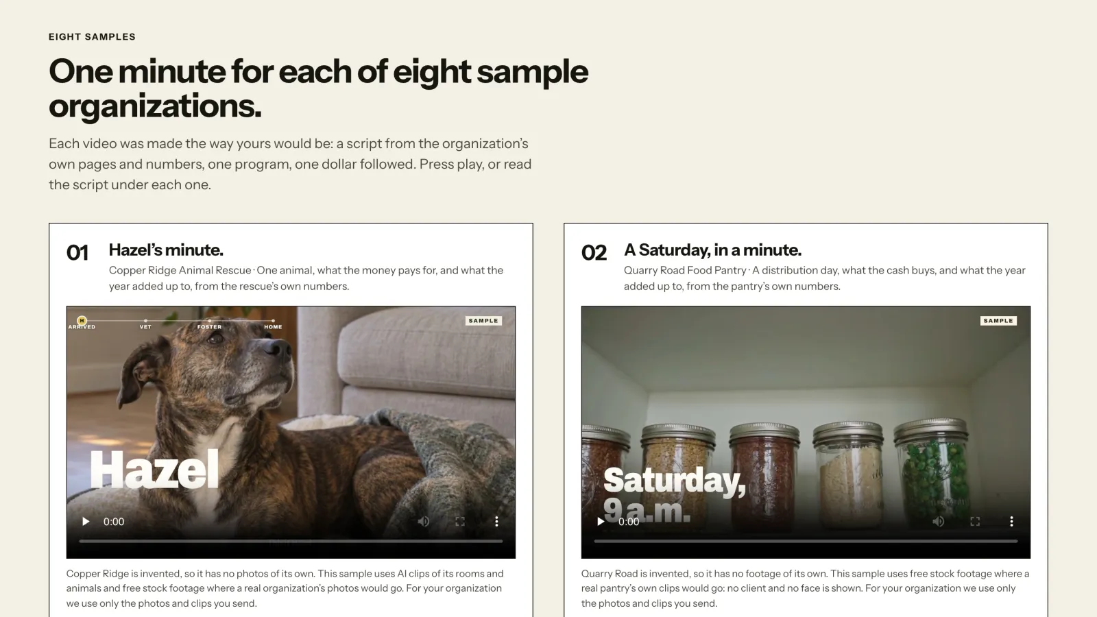
So the rules we keep are the branding rules. Only the organization’s own photographs and clips, never an AI-generated scene or person, no stock footage at all; every number from the website or the filing, or confirmed in writing; the director’s own voice if there is a memo, otherwise the words on screen; captions burnt in, in case it plays with the sound off; no child’s face, ever. The nine sample videos were made for invented organizations that have no footage of their own, so they use free stock footage (and, for Copper Ridge, some AI-generated clips of its rooms and animals), a synthetic voice and AI-generated music, and the Videos page says so beside each player. If you are comparing production companies, the same page sets out three ways to get a video made and seven questions to ask any quote. A video for a real organization does not need that disclosure, because nothing in it pretends to be something else.
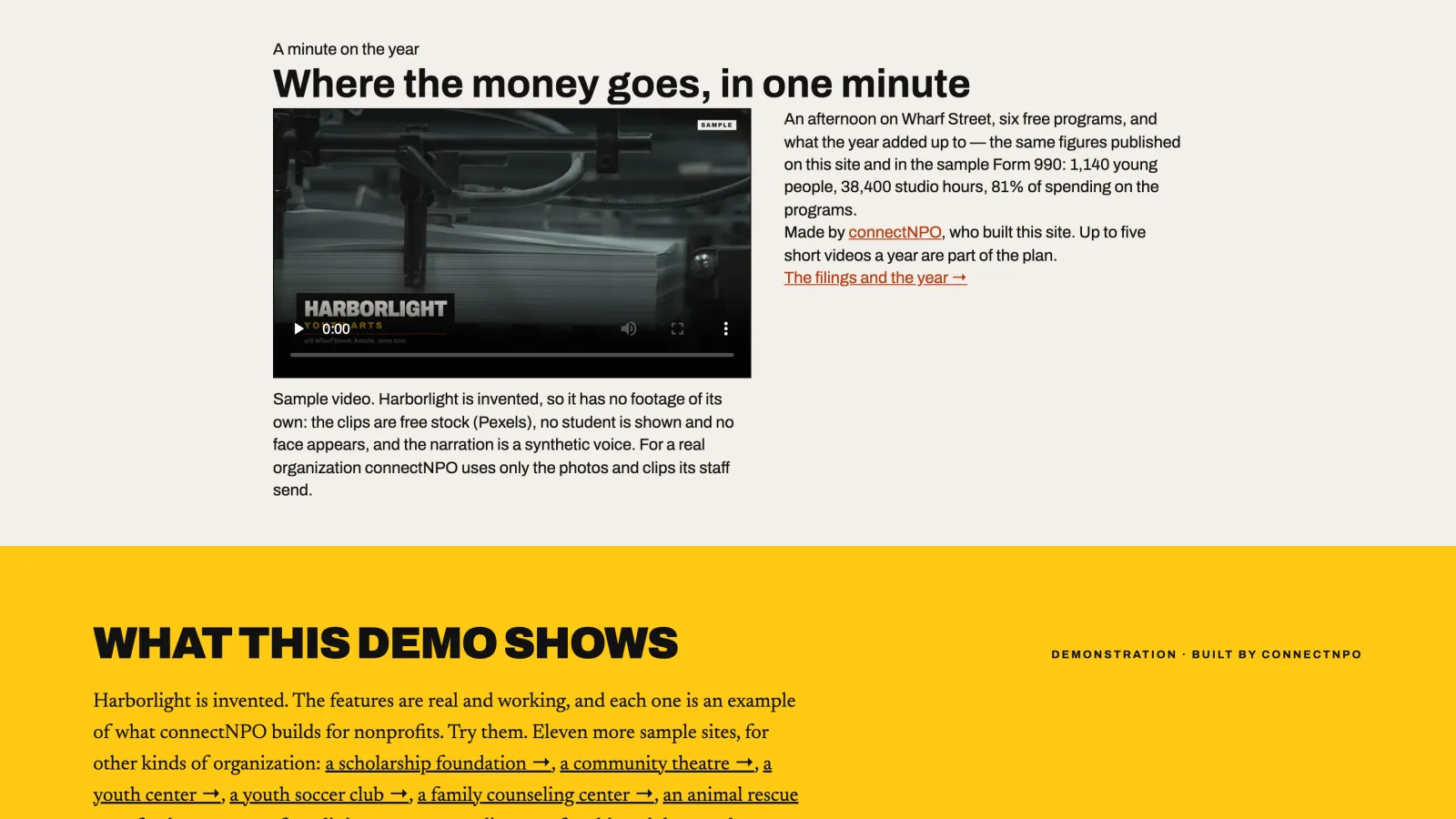
What the video does for the brand, then, is not magic. It is the sentence, the numbers and the photographs, in order, in sixty seconds, on the page a stranger reaches first. Watch Harborlight Youth Arts, one of the samples: four o’clock on Wharf Street, six free programs, 1,140 young people in a year, 81% of spending on the programs, and where to read the filings. The figures are the ones on its own site. Every website on the connectNPO plan comes with up to five of these a year, made only from what the organization sends, within a week, at $180 a month on top of the one-time build fee, with nothing extra for the videos (the one plan).
Where the minute goes
Five a year is enough for the pages that matter and the months that matter. One at the top of the home page, muted, with captions, in place of three paragraphs. One beside the ask on the donation page, following a dollar through the work. One for November, in the year-end email and the home-page banner. One vertical cut for social media. And one for whatever the year needs: registration is open, the show opens Friday, volunteers are needed.
Where it does not go is on a page that contradicts it. If the video says 1,140 young people and the impact page says 1,200, the brand is the disagreement. That is why the video is made last, from the website, and why the donation page examples on our samples are worth reading beside the videos: the figures have to agree.
Five videos a year come with the website.
One plan: $180 a month plus a $1,000 build fee, paid only after you approve the finished site. The sentence, the numbers, the photographs and the minute, kept current by us. Fifteen working sample sites to press first.
See the plan and apply →Or start with the fifteen sample sites (each carries a one-minute video on the home page), and with Harborlight Youth Arts to see the whole first minute at once.
connectNPO builds and looks after nonprofit websites. We do not provide legal, tax, accounting or Form 990 advice; figures quoted from the sample sites are samples for invented organizations.
To tell a whole year in one minute, from the place to where the money went, see our guide to the nonprofit annual report video.
Frequently asked questions
How long should a nonprofit video be?
About a minute for the website and the donation page, and a shorter vertical cut for social media. In an analysis of more than thirteen million videos, Wistia found that videos under a minute were watched about half way through on average; those are marketing videos rather than appeals, so treat it as a direction. A minute is also long enough for one sentence, three numbers and the place.
What should never appear in a nonprofit video?
An AI-generated person or scene, stock footage of any kind, a child’s face, and any number that is not on your website or in your filing. Each of those can be found out, and a brand built on trust does not survive being found out. Use your own photographs and clips, and say where every figure comes from.
What makes a nonprofit video good for branding?
It shows the real place and the real work, it names specific things the money bought, it says the same numbers the website says, and it is short enough to be watched to the end. Captions matter in case it is played with the sound off. A synthetic person or a stock family standing in for real people works against trust.
Can we make the video ourselves?
Yes. A phone, a shot list, natural light and ten-second clips of the place and the work are the raw material. The hard parts are the script and the discipline to keep every number true, which is why the video should be written from the website and the filing, not from memory.
Is the video included in the connectNPO plan or extra?
Included. Every website on the plan comes with up to five one-minute videos a year, made only from the photos and clips the organization sends, delivered within one week of receiving the material, in a wide version for the site and a vertical version for social media. There is no higher tier and no add-on.